WALALANGI & PARTNERS
A DECADE OF DISTINCTION · BRAND ARCHITECTURE

This corporate identity and brand architecture presentation is exclusively optimized for Landscape displays with a minimum width of 1024px.

10TH ANNIVERSARY

A DECADE OF DISTINCTION
WALALANGI & PARTNERS · CORPORATE REBRAND

A Decade of Distinction
Ten Years of Proven Legacy

Ten years of counsel across premier M&A, banking & finance, and landmark Indonesian mandates. A decade forged in commercial intelligence, cross-border fluency with Nishimura & Asahi, and an architectural brand evolution designed for the future.


THENEXTCHAPTER

Honoringthelegacy.Embracingthefuture

From a Decade of Excellence to the Next Horizon of Authority

Marking ten years of tier-one legal practice and strategic association with Nishimura & Asahi. Rebranding is not merely aesthetic renewal; it is the deliberate architectural calibration of Walalangi & Partners’ visual authority to match its standing as Indonesia's premier cross-border corporate counsel.

Decade of Distinction

The Tripartite Evolution of Firm Identity

Honoring a decade of foundational legacy, aligning with Nishimura & Asahi’s global brand evolution, and inaugurating the firm’s next-generation visual identity.

Honoring the 10-Year Foundational Mark

Designed at the firm's inception, the original identity successfully anchored a decade of landmark corporate practice—establishing Walalangi & Partners as a premier Indonesian legal counsel. Reaching the ten-year milestone marks the proud culmination of its inaugural era, setting the stage for institutional renewal.

10-Year Foundational Mark
Strategic Alignment with Nishimura & Asahi’s Global Rebrand

In strategic association with Japan’s preeminent law firm, the identity reflects international institutional parity. As Nishimura & Asahi completed its own sophisticated global rebrand across Tokyo, Singapore, and key financial hubs, Walalangi & Partners calibrates its visual architecture to project seamless cross-border synergy for multinational boardroom mandates.

Nishimura & Asahi Global Rebrand Alignment
The Next-Generation Mark: Precision & Timelessness

The newly unveiled visual identity synthesizes ten years of partner prestige with mathematical vector precision. Featuring modern typographic hierarchy, refined proportions, and the distinctive interlocking motif, the next-generation mark delivers flawless clarity across high-resolution digital interfaces, Virtual Data Rooms, and formal cross-border execution.

Next-Generation Mark Precision & Timelessness
THEPROLOGUE

PROVENJURISPRUDENCE·SHAPINGTHENEXTERA

The Architecture
of Distinction

Guided by a design philosophy of architectural precision and institutional permanence, the identity translates ten years of premier commercial counsel into an authoritative visual language. Every contour is mathematically calibrated to reflect boardroom gravitas, technical determinism, and seamless international parity with Nishimura & Asahi.

LOGO CONSTRUCTION
GEOMETRIC CONSTRUCTION - SCHEMATIC ANALYSIS OPTICAL CORRECTIONS AND PROPORTIONAL BALANCE Φ Phi (Φ) Proportions Φ Φ Φ Φ Φ in association with 61 mm 55 mm 43 mm 43 mm Angle α = 72° 72° α° 72° 12° 102 mm 283 mm Angle α = 72° α° θ° 62 mm 189 mm Spacing measurement 26 mm Tangency Point T1 Tangency Point T1 550 mm Tangency Point T1 Radius r1 r1 Pf 220 mm 60 mm 110 mm 8 mm 188 mm Spacing measurement 2630 mm 120 mm

VISUAL IDENTITY

A distinguished institutional identity is recognized far beyond its standalone mark; it lives through the unified rigor, deliberate precision, and quiet confidence of its complete visual ecosystem.

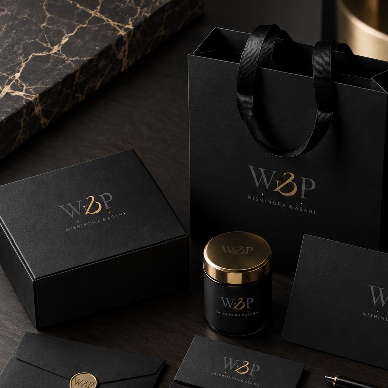
From bespoke executive stationery and cross-border advisory dossiers to formal digital touchpoints, every structural proportion, typographic cadence, and tactile material texture is engineered to project enduring boardroom authority alongside global partner Nishimura & Asahi.

Walalangi & Partners Visual Identity Mockup
BRAND
STRATEGY

Strategic market positioning and trusted regulatory stewardship across complex cross-border transactions.

BRAND
IDENTITY

Architectural monogram calibrated for boardroom authority, institutional gravitas, and mathematical harmony.

PRINT &
COLLATERAL

Executive stationery, pitch dossiers, and formal credential binders crafted with tactile refinement.

CREATIVE
DIRECTION

Cohesive visual stewardship and continuous brand parity alongside global partner Nishimura & Asahi.

TYPOGRAPHY
Aa
Bb
PRIMARY TYPEFACE - Cormorant Garamond
REGULAR / MEDIUM / BOLD
A B C D E F G H I J K L M N O P Q R S T U V W X Y Z
a b c d e f g h i j k l m n o p q r s t u v w x y z
1 2 3 4 5 6 7 8 9 0
SECONDARY TYPEFACE - Poppins
LIGHT / REGULAR / SEMIBOLD
A B C D E F G H I J K L M N O P Q R S T U V W X Y Z
a b c d e f g h i j k l m n o p q r s t u v w x y z
1 2 3 4 5 6 7 8 9 0
COLOR PALETTE
#EDD79B
#0D0D0D
#F2EDE4
#B8AA93
BRAND STRATEGY & VOICE
BRAND VALUES

AUTHENTICITY

Uncompromising ethical determinism and regulatory stewardship.

QUALITY

Architectural precision in every tier of commercial counsel.

INNOVATION

Forward-thinking structures navigating dynamic cross-border markets.

CONNECTION

Enduring boardroom relationships anchored in mutual trust.

BRAND PERSONALITY
Classic Modern
Minimal Expressive
Reserved Authoritative
Complex Simple
TONE OF VOICE
01

AUTHORITATIVE

Concise, deterministic counsel delivering boardroom clarity without ambiguity.

02

SOPHISTICATED

Understated elegance and intellectual rigor, avoiding unnecessary hyperbole.

03

STRATEGIC

Anticipating cross-border nuances with sharp commercial perspective.

04

INSTITUTIONAL

Permanent gravity reflecting seamless parity with Nishimura & Asahi.

VISUAL STYLE
Walalangi & Partners Brand Mockup 1
Walalangi & Partners Brand Mockup 2
Walalangi & Partners Brand Mockup 3
Walalangi & Partners Brand Mockup 4
THEMETAMORPHOSIS

TENYEARS,ONELEGACY·DEFININGTHENEXTERA

The Signature of
Revealed in Geometry.

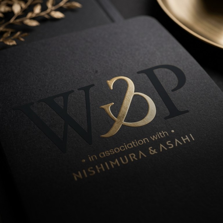
Concealed at the focal core of the monogram lies a deliberate secret: the Roman numeral ‘X’. More than an interlocking geometric intersection, it serves as a quiet monument to ten years of preeminent corporate advisory—an institutional milestone encapsulating a decade of tier-one transactional stewardship, bilateral cross-border harmony, and unwavering market authority. Rather than broadcasting its tenure through superficial embellishment, the firm embeds this decade directly into the structural essence of its mark, rewarding those who observe with discerning architectural intent.

Woven into this form is an enduring truth: true sophistication favors simplicity over complexity. A truly masterclass identity refuses to think merely outward to command external attention; it looks inward to distill and quiet the noise of intricate realities. In a legal landscape governed by multifaceted transactions and high-stakes complexities, the Signature ‘X’ achieves timeless distinction by doing what is hardest of all: resolving dense corporate gravity into an irreducible, harmonious form. It affirms that the ultimate expression of prestige is not the addition of ornamentation, but the supreme elegance of subtraction.

Hover cursor over the logo to interact
GEOMETRY

Convergent ‘W’ Core

Extracted from the harmonic intersection of the two central diagonal strokes of the letter ‘W’, establishing bilateral structural equilibrium.

Decade of Distinction

Directly encoding ten years of distinguished counsel into the firm’s visual anatomy—a commemorative Roman ‘X’ celebrating a decade of excellence.

Cross-Border Meridian

Intersecting axes manifesting permanent synergy between Walalangi & Partners and Nishimura & Asahi across Tokyo and Jakarta.

Harmonic Equilibrium

Calibrated to the golden ratio (1:1.618), preserving structural harmony, bilateral symmetry, and enduring visual authority across all scales.

Walalangi & Partners Signature X Mockup